Retro Poster AI Art Generator

Flat blocked colour, halftone grain, shapes simple enough to read from across a station. Describe the scene, pass the human check, download the file. Artlist is free.

The style

Where the look actually comes from

The retro poster look is a printing constraint that outlived the printing press. Mid-century travel and transit posters were screen printed, which meant each colour was a separate physical screen. Four or five colours was the practical limit, so designers built images out of flat shapes rather than blends, and reserved detail for wherever the eye would land first.

Two artefacts of that process are now the whole aesthetic. Halftone — printing tone as a field of dots — is how a flat-colour process faked gradients, and it survives as texture. Misregistration, where one screen sits a fraction off the others, was originally a defect; asking for it is what stops a render looking like clean modern vector art.

Composition inherits the same discipline. A poster has to work at a distance and leave room for type, so the shapes are large, the horizon sits high or low rather than centred, and there is a deliberately empty margin. Say that out loud in the prompt and Artlist gives you something you can actually set a headline on.
Example renders

What Artlist gives you in this style

Every image below came out of the free Artlist prompt box — no retouching and no compositing. Where a frame belongs to a neighbouring style, the tag on it says so.

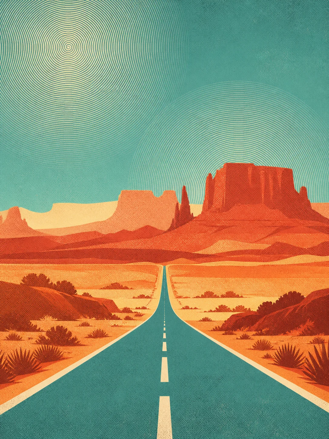
Retro posterRetro poster AI art from Artlist: a mid-century desert highway at sunset in flat blocks of rust, cream and turquoise with halftone texture
Four colours, one roadRust, cream, turquoise and black, and nothing blended anywhere. The halftone in the sky is doing all the work a gradient would have done.
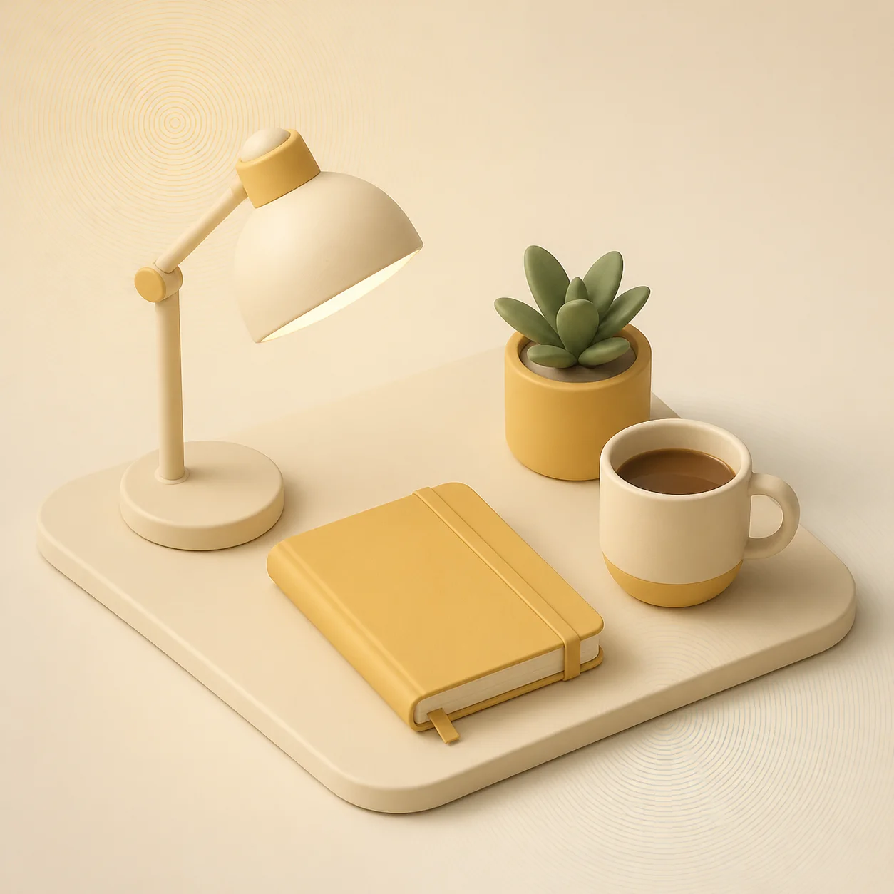
3D render3D render AI art example: an isometric desk scene in soft matte clay materials under gentle studio lighting on a pale background
The clean cousinA 3D render reaches the same simplicity by a different route — soft light and matte materials rather than flat ink. Same restraint, opposite surface.
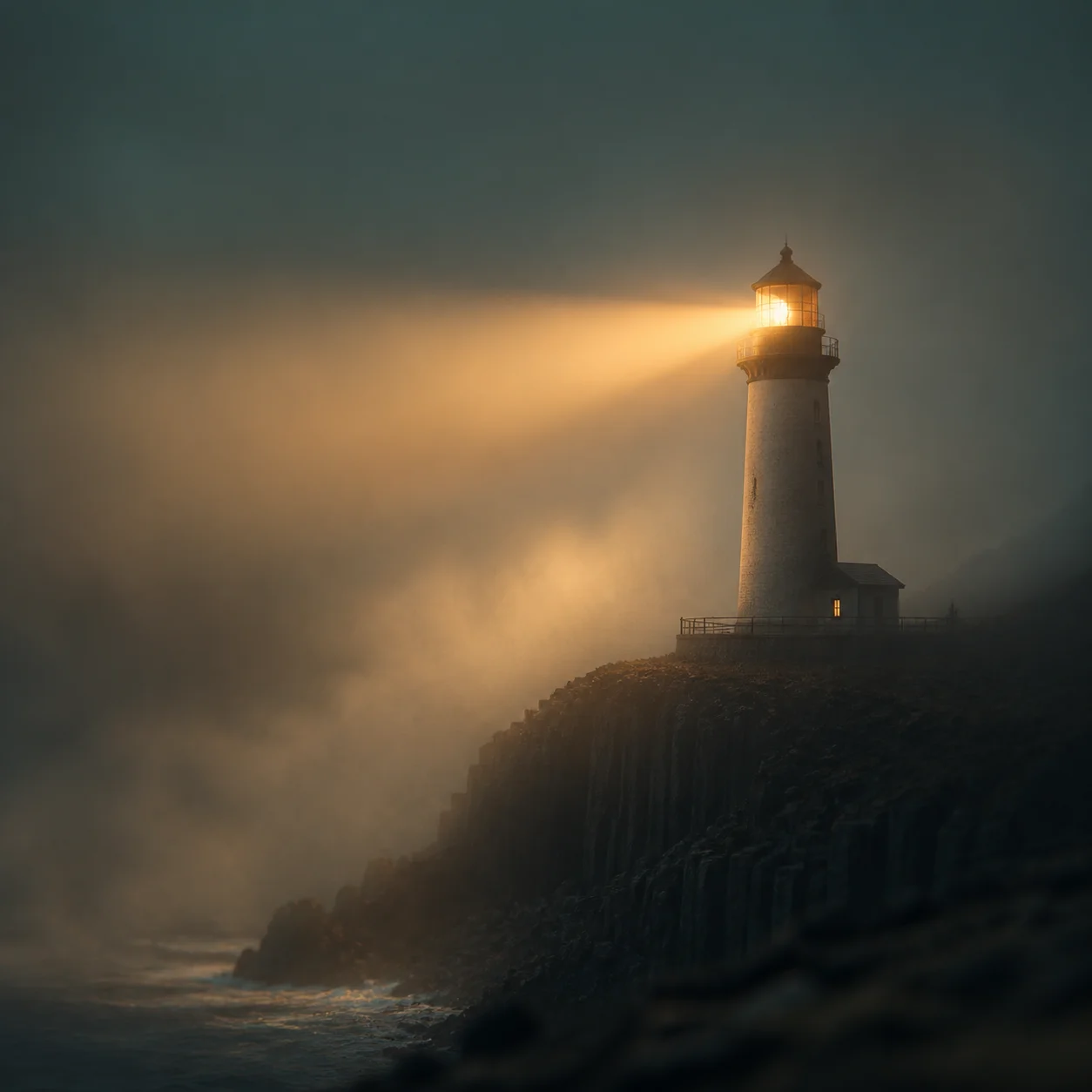
CinematicCinematic AI art from Artlist: a lighthouse on a basalt cliff in heavy dusk fog with a single amber beam and a teal and gold colour grade
Where the edge isPhotographic light and continuous tone make the same subject impossible to screen print. Everything the poster style does is a refusal of this kind of frame.
Generate now

The Retro poster generator, right here

The prompt box is already seeded with a Retro poster sentence. Change the subject, keep the light and lens words, and generate. No account, no credits, no watermark.

Artlist AI art generator100% freeNo accountNo watermark

A one-tap human check runs before Artlist generates your image. Prompts are never tied to an identity.

Result

Your AI artwork renders here.
Roughly six seconds, start to finish.

Copy these

Six Retro poster prompts that hold up

Paste one into the Artlist AI art generator, swap in your own subject, and leave the light and lens words alone on the first pass. Each note says what the prompt leans on.

Travel

A mid-century travel poster of a desert highway at sunset, flat blocks of rust, cream and turquoise, halftone texture, hard geometric shapes, four-colour screen print, retro poster

Leans on: a named colour count. “Four-colour screen print” caps the palette, and the cap is what makes the shapes simplify themselves.

Space age

Poster of a 1960s rocket on the launch pad, flat colour separations, heavy black keyline, cream paper stock, slight misregistration between plates, retro poster

Leans on: the keyline. A heavy black outline around flat shapes is the single fastest way to date a render to mid-century printing.

National park

A national park poster of a granite valley, layered ridges in four flat tones, the low sun as a single circle, grain overlay, wide empty margin along the bottom, retro poster

Leans on: layered flat tones. Four stacked values read as distance without any perspective, which is how the whole poster genre handles depth.

Transit

Poster of a coastal railway carriage seen from below, bold diagonal composition, teal and burnt orange only, halftone dot shading across the sky, retro poster

Leans on: the low camera. A bold diagonal from underneath gives a static object drama that flat colour cannot supply on its own.

Advertisement

A vintage coffee advertisement layout: one steaming cup, flat cream ground, muted brick red and olive accents, aged ink texture, generous negative space, retro poster

Leans on: negative space. Leaving most of the frame empty is not laziness — it is where the headline goes, and it is what makes the object look designed.

Winter sport

Poster of a lone skier on an alpine ridge, three flat tones of blue plus cream, hard-edged shadow shapes, visible paper grain, screen-printed look, retro poster

Leans on: value before hue. Three tones of one colour plus cream produces a poster that still reads when printed in black and white.

Prompt ingredients

The words that actually move the render

Four categories carry a Retro poster prompt; the rest is decoration. Pick one from each and you have a working sentence before writing any adjective about quality.

Colour count

Two, three or four flat colours, named. Screen print, colour separations, limited palette. Capping the count is what forces the shapes to simplify.

Start here

Print texture

Halftone dots, grain overlay, aged ink, slight misregistration, cream paper stock. These are the fingerprints of a physical press and they are what read as vintage.

The artefacts

Shape language

Hard geometric shapes, heavy keyline, simplified layered ridges. Say that curves should be confident and edges hard — soft anything undoes the whole style.

Keep it flat

Layout

Wide bottom margin, high horizon, generous negative space, bold diagonal. A poster is a layout before it is a picture, so give the composition its own clause.

Room for type

What to leave out: realism of every kind. Photorealistic, ultra detailed and volumetric lighting all fight the flat separations directly. If a shape needs to feel three-dimensional, ask for one halftone shadow rather than for shading.

FAQ

Retro poster questions

Licensing is covered in the royalty-free AI art notes, and the general questions are answered in the full FAQ.

Ask for the printing defects. Halftone dots, grain overlay, aged ink texture and slight misregistration between plates are exactly what a clean digital illustration lacks, and adding them dates the image immediately.

Yes, and you should say so. “Wide empty margin along the bottom” or “generous negative space at the top” gives you a frame you can set type on instead of a full-bleed image you have to crop.

Three or four, named individually. Rust, cream and turquoise gives the generator a real constraint; “vintage colours” gives it nothing and usually returns a muddy sepia wash.

Yes. Images you generate on Artlist are yours to publish, adapt and sell. Avoid prompting for a real railway company, park service or airline by name, since their marks and branding are not covered by that.

Start now

Four colours, one strong shape

The retro poster AI art generator is the free prompt box above. Copy a prompt, name your own three colours, and leave a margin for the headline.

No accountNo creditsNo watermark